The Gamma Simple code behind interactive articles

There are huge amounts of data around us that we could use to better understand the world. Every company collects large amounts of data about their sales or customers. Governments and international organizations increasingly release interesting data sets to the public through various open government data initiatives (data.gov or data.gov.uk). But raw data does not tell you much.
An interesting recent development is data journalism. Data journalists tell stories using data. A data driven article is based on an interesting observation from the data, it includes (interactive) visualizations that illustrate the point and it often allows the reader to get the raw data.
Adding a chart produced in, say, Excel to an article is easy, but building good interactive visualization is much harder. Ideally, the data driven article should not be just text with static pictures, but a program that links the original data source to the visualization. This lets readers explore how the data is used, update the content when new data is available and change parameters of the visualization if they need to understand different aspect of the topic.
This is in short what I'm trying to build with The Gamma project. If you're interested in building better reports or data driven articles, continue reading!

I did a talk about The Gamma project at the fantastic Future Programming workshop at the StrangeLoop conference last week (thanks for inviting me!) and there is a recording of my 40 minute talk on YouTube, so if you prefer to watch videos, check it out!
Are you a data journalist or data analyst? We're looking for early partners! I joined the EF programme to work on this and if the project sounds like something you'd like to see happen, please get in touch or share your contact details on The Gamma page!
Why reporting needs innovation
There is a number of reasons why data journalism and reporting in general need better tools. When I see a report on a problem that I want to understand better, I want to be able to see how exactly is the report created and how are the inputs pre-processed. I want to be able to modify some of the parameters (for example, add another country to a comparison) or see what a different view of the data would say (look at per capita values rather than absolute numbers). Sadly, this is almost never possible. What I would like to see is an environment that offers these three properties:
-
Reproducibility - The report should be fully reporoducible. Serious newspapers cite their data sources, but reproducing report using just a citation involves a lot of manual work. It should be possible to reproduce the results and verify their correctness just by rerunning the code behind the report.
-
Transparency - Reproducibility is a good start, but we should also be able to change the report easily. I want to be able to change parameters and see how that affects the result. Does it still support the story? I want to see that the report is not misleading, intentionally (or unintentionally).
-
Interactivity - Finally, I think we should also enable novel user experience with reports. Newspaper are no longer (just) printed on paper where we need text and images. We should use the reproducibility and transparency behind reports to allow new user experiences. The reader should be able to explore the data and do some of the changes without being a programmer.
I think many would agree with these points. It's just hard to make this easy and accessible enough. The Data Journalism Handbook describes some of the tools that people use currently. Most non-programmers obtain data by hand and then use tools like Google Sprehadsheets and Excel (making reproducibility and transparency hard). Pre-processing is done using ad hoc scripts (using Perl, R, Python etc.) that are not very general and would not work on different inputs. And finally, the few reports that are interactive are usually single-purpose applications (typically written in JavaScript).
How can we do better
Modern programming languages have a number of features that make working with data much easier than before. Features like LINQ in C# (inspired by functional style) make it easy to transform data and type providers in F# integrate external data sources directly into the programming language. If you have not seen type providers before, the following is a demo showing the World Bank type provider running inside the Ionide project (inside the Atom editor):
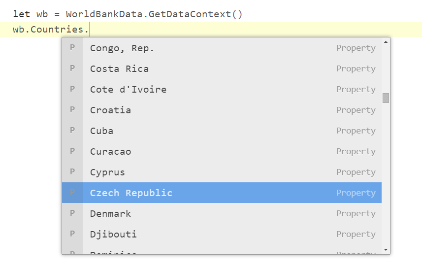
The type provider imports all data sources from the World Bank directly into the type system. You type "." and see all the countries, then you type "." again and you can choose one from the thousands of available indicators.
F# type providers are fantastic if you are programmer, but I think they also illustrate the kind of experience that we could build for anyone who is working with data. Typing "." in the editor is not that different from clicking the "Search" button in Google and choosing an option in the Atom auto-complete is not that different from choosing an option in a drop-down on a web page.
Try The Gamma prototype
I would not be writing this blog post if I didn't have anything to show! I put together a prototype that shows some of the ideas. It is very basic, but it demonstrates the experience that I believe all visualizations on the web should have in the future. The example uses the World Bank data and compares countries in the world based on their CO2 emissions:
This is very much work in progress. I focused on building a demo that illustrates the idea, but there are certainly issues. You can report them on GitHub and if the whole demo is down, ping me at @tomaspetricek!
It looks like China is the largest producer of CO2 emissions in the world followed by the US. But there are a few interesting questions you can ask about the data - and the interactive visualization lets you explore those:
-
What was the situation like in 1990 or 1980? You can explore this by clicking "options" and changing the year using the drop down. (When did China overtook US as the largest polluter?)
-
What if we compare CO2 emissions per capita rather than absolute numbers? (It turns out that large developing countries like China and India are no longer the largest polluters...)
-
How is this actually created? There is no pre-processing in this demo, but you can still see all the details (like the color scheme) if you click on the "source" button.
As you can see, it is possible to embed visualization created using The Gamma into your own web page (ping me if you are interested). The exmple is part of a larger demo that I created, which shows other interesting aspects of the project. Check out the full version of the CO2 emissions demo on The Gamma web site.
The third example on the page (pie chart) is a bit more interesting, because it implements a simple pre-processing. It takes top 6 countries and shows them together with all other countries. This is an aspect that cannot be changed in "options", but you can see it in the "source" view:
1: 2: 3: 4: 5: 6: 7: 8: |
|
I believe this kind of transformation is easy enough and with good tooling, we can make it accessible not just for programmers, but even for technically skilled journalists or anyone who works on data analytics. Feel free to experiment with the prototype, though keep in mind that the library is very much incomplete.
Article is a literate program
The key idea that I think can change how data reporting is done is to treat articles as programs. In the prototype, the source code for the CO2 report is simply a Markdown document on GitHub.
Everything else is generated from the source. When you open the report in a web browser, you see a rendering that shows the text with the resulting charts (the code is executed). The more interesting thing is that when you click on "options", The Gamma looks for specific patterns in the source code and generates editors for them. The current implementation looks for two patterns.
-
When there is a choice from one of several members, for example years in
world.byYear.2010, we generate drop-down with other members. -
When the code creates a list, for example
[ countries.USA; countries.UK ]in the last example in the CO2 report, we generate a select element.
This is just a very basic thing that can be done when we have the full source code and there are many other interesting features I'd like to add. If you see a number in text, say the GDP of USA is 16.77 trillion USD, this does not tell you much - but if we know the source of the number and how it is computed, we can automatically provide the context. What about other countries? And how has it been changing?
Summary
Saying that programming is the new literacy would be a (perhaps quite silly) overstatement, but I do think that understanding information around us is becoming increasingly important. This applies to public information (e.g. open government data) but also to business data inside companies.
Journalists and data analysts help us by finding interesting information in data and presenting them to us. But how can we make sure that the analysis is done correctly and does not show misleading information? And how can we build on top of it to explore the information further and get better understanding?
This is exactly what I'm trying to do with The Gamma project and I would like to hear from anyone interested! Get in touch at tomas@tomasp.net or @tomaspetricek.
Full name: thegamma.sumRest
Full name: thegamma.topAndRest
Published: Monday, 28 September 2015, 6:07 PM
Author: Tomas Petricek
Typos: Send me a pull request!
Tags: thegamma, type providers, data journalism, programming languages