Choose Your Own Adventure Calculus
The rule of three suggests that if you encounter the same pattern for the third time in your code, you should refactor it into a reusable abstraction. The same thing applies in programming language theory. When you find that you are doing the same thing for the third time, it is probably a good idea to stop and think - is there a general pattern?

Figure 1. Auto-completion list showing possible operations in The Gamma
In my PhD thesis on context-aware computations, I did exactly this. When we realised that liveness analysis, resource tracking and checking of data-flow computations all require type system with similar structure, we came up with the idea of coeffects, which is an abstraction that can capture all three (and so, you only need to add one mechanism for tracking context into your language).
Recently, the same thing happened to me again. A lot of my work has been around interaction with programming systems. I am interested in looking not just at the programming languages, but also the stateful, interactive systems they are part of - and how programs are created through interactive editor tools, gradually revised in notebook systems or how proofs are created in interactive proof assistants. And interestingly, in three recent collaborations around those ideas, we ended up finding a very similar pattern.
In multiple different systems, we encountered a pattern where the programming system iteratively offers the user (programmer, data scientist, proof theoretician) a choice of options that the user can choose from to construct or refine their program (see Figure 1). In all systems, the user can also edit the code in other ways, but a lot (sometimes everything!) can be done just by choosing options.
I now have three examples, so it is time to describe the general pattern. Earlier, we called this (jokingly) dot-driven development, (seriously) AI assistants and (foolishly) iterative prompting. For the lack of a better name, I will refer to the abstraction as the choose-your-own-adventure calculus.
Published: Sunday, 2 February 2025, 2:52 PM
Tags:
research, academic, programming languages, thegamma, type providers
Read the complete article
Creating interactive You Draw bar chart with Compost
For a long time, I've been thinking about how to design a data visualization library that would make it easier to compose charts from simple components. On the one hand, there are charting libraries like Google Charts, which offer a long list of pre-defined charts. On the other hand, there are libraries like D3.js, which let you construct any data visualization, but in a very low-level way. There is also Vega, based the idea of grammar of graphics, which is somewhere in between, but requires you to specify charts in a fairly complex language including a huge number of transformations that you need to write in JSON.
In the spirit of functional domain specific languages, I wanted to have a small number of simple but powerful primitives that can be composed by writing code in a normal programming language like F# or JavaScript, rather than using JSON.
My final motivation for working on this was the You Draw It article series by New York Times, which uses interactive charts where the reader first has to make their own guess before seeing the actual data. I wanted to recreate this, but for bar charts, when working on visualizing government spending using The Gamma.
The code for this was somewhat hidden inside The Gamma, but last month, I finally extracted all the functionality into a new stand-alone library Compost.js with simple and clean source code on GitHub and an accompanying paper draft that describes it (PDF).
In this article, I will show how to use Compost.js to implement a "You Draw" bar chart inspired by the NYT article. When loaded, all bars show the average value. You have to drag the bars to positions that you believe represent the actual values. Once you do this, you can click "Show me how I did" and the chart will animate to show the actual data, revealing how good your guess was. Before looking at the code, you can have a look at the resulting interactive chart, showing the top 5 areas from the 2015 UK budget (in % of GDP):
Published: Thursday, 16 July 2020, 11:20 PM
Tags:
functional, functional programming, data science, thegamma, data journalism, visualization
Read the complete article
Data exploration calculus: Capturing the essence of exploratory data scripting
Most real-world programming languages are too complex to be studied using formal methods. For this reason, academics often work with simple theoretical languages instead. The λ-calculus is a simple formal language that is often used for talking about functional languages, the π-calculus is a model of concurrent programming and there is an entire book, A Theory of Objects modelling various object-oriented systems.
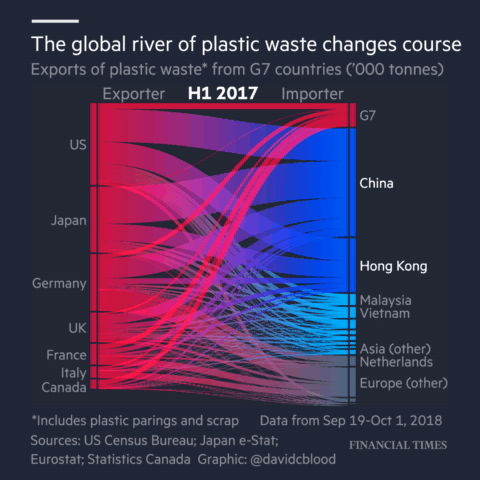
Animation from Financial Times article "Why the world's recycling system stopped working".
Those calculi try to capture the most interesting aspect of the programming language. This is function application in functional programming, sending of messages in concurrent programming and object construction with inheritance in object-oriented programming.
Recently, I have been working on programming tools for data exploration. In particular, I'm interested in the kind of programming that journalists need to do when they work with data. A good example is the coding done for the Why the world's recycling system stopped working article by Financial Times, which is available on GitHub.
Although data journalists and other data scientists use regular programming languages like Python, the kind of code they write is very different from the kind of code you need to write when building a library or a web application in Python.
In a paper Foundations of a live data exploration environment that was published in February 2020 in the open access Programming Journal, I wanted to talk about some interesting work that I've been doing on live previews in The Gamma. For this, I needed a small model of my programming language.
In the end the most interesting aspect of the paper is the definition of the data exploration calculus, a small programming language that captures the kind of code that data scientists write to explore data. This looks quite different from, say, a λ-calculus and π-calculus. It should be interesting not only if you're planning to do theoretical programming language research about data scripting, but also because it captures some of the atypical properties of the programs that data scientists write...
Published: Tuesday, 21 April 2020, 3:42 PM
Tags:
academic, research, programming languages, thegamma, data science
Read the complete article
Getting started with The Gamma just got easier
Over the last year, I have been working on The Gamma project, which aims to make data-driven visualizations more trustworthy and to enable large number of people to build visualizations backed by data. The Gamma makes it possible to create visualizations that are built on trustworthy primary data sources such as the World Bank and you can provide your own data source by writing a REST service.
A great piece of feedback that I got when talking about The Gamma is that this is a nice ultimate goal, but it makes it hard for people to start with The Gamma. If you do not want to use the World Bank data and you're not a developer to write your own REST service, how do you get started?
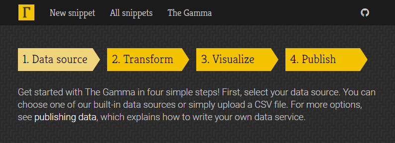
To make starting with The Gamma easier, the gallery now has a new four-step getting started page where you can upload your data as a CSV file or paste it from Excel spreadsheet and create nice visualizations that let your reader explore other aspects of the data.
Head over to The Gamma Gallery to check it out or continue reading to learn more about creating your first The Gamma visualization...
Published: Wednesday, 14 June 2017, 2:27 PM
Tags:
thegamma, data journalism, data science, research, visualization
Read the complete article
Towards open and transparent data-driven storytelling: Notes from my Alan Turing Institute talk
As mentioned in an earlier blog post, I've been spending some time at the Alan Turing Institute recently working on The Gamma project. The goal is to make data visualizations on the web more transparent. When you see a visualization online, you should be able to see where the data comes from, how it has been transformed and check that it is not misleading, but you should also be able to modify it and visualize other aspects of the data that interest you.
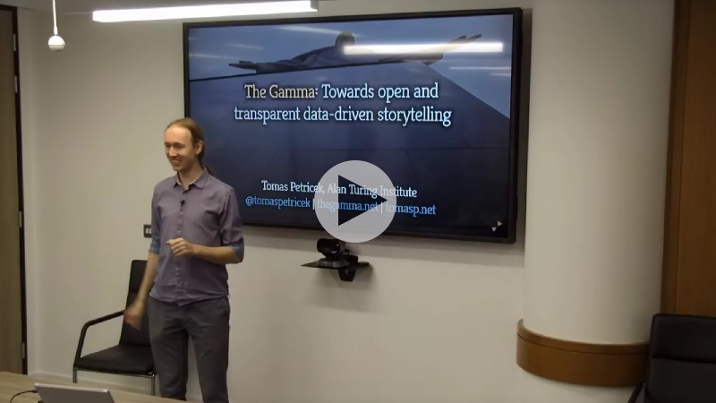
I gave a talk about my work as part of a talk series at The Alan Turing Institute, which has been recorded and is now available on YouTube. If you prefer to watch talks, this is a good 45 minute overview of what I've been working on with great video quality (the video switches from camera view to screen capture for demos!)
If you prefer text or do not have 45 minutes to watch the talk (right now), I wrote a short summary that highlights the most important ideas from the talk. You can also check out the talk slides, although I'll include the most important ones here.
Published: Thursday, 2 March 2017, 12:53 PM
Tags:
thegamma, data journalism, programming languages
Read the complete article
The Gamma dataviz package now available!
There were a lot of rumors recently about the death of facts and even the death of statistics. I believe the core of the problem is that working with facts is quite tedious and the results are often not particularly exciting. Social media made it extremely easy to share your own opinions in an engaging way, but what we are missing is a similarly easy and engaging way to share facts backed by data.

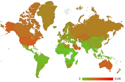
This is, in essence, the motivation for The Gamma project that I've been working on recently. After several experiments, including the visualization of Olympic medalists, I'm now happy to share the first reusable component based on the work that you can try and use in your data visualization projects. If you want to get started:
- Check out thegamma-script package on npm
- Minimal example of thegamma-script in action
- How to use thegamma-script in your projects
The package implements a simple scripting language that anyone can use for writing simple data aggregation and data exploration scripts. The tooling for the scripting language makes it super easy to create and modify existing data analyses. Editor auto-complete offers all available operations and a spreadsheet-inspired editor lets you create scripts without writing code - yet, you still get a transparent and reproducible script as the result.
Published: Wednesday, 25 January 2017, 1:31 PM
Tags:
thegamma, data journalism, data science, research, visualization
Read the complete article
Can programming be liberated from function abstraction?
When you start working in the programming language theory business, you'll soon find out that
lambda abstraction and functions break many nice ideas or, at least, make your life very hard.
For example, type inference is easy if you only have var x = ..., but it gets hard once you
want to infer type of x in something like fun x -> ... because we do not know what is
assigned to x. Distributed programming is another example - sending around data is easy, but
once you start sending around function values, things become hard.
Every programming language researcher soon learns this trick. When someone tells you about a nice idea, you reply "Interesting... but how does this interact with lambda abstraction?" and the other person replies "Whoa, hmm, let me think more about this." Then they go back and either give up, because it does not work, or produce something that works, in theory, well with lambda abstraction, but is otherwise quite unusable.
When working on The Gamma project and the little scripting language it runs, I recently went through a similar thinking process. Instead of letting lambda abstraction spoil the party again, I think we need to think about different ways of code reuse.
Published: Tuesday, 27 September 2016, 5:53 PM
Tags:
thegamma, research, programming languages
Read the complete article
The Gamma — Visualizing Olympic Medalists
Olympic Games are perfect opportunity to do a fun data visualization project - just like New Year, you can easily predict when they will happen and you can get something interesting ready in advance. I used this year's Games in Rio as a motivation to resume working on The Gamma project. If you did not read my previous article, the idea is to build tooling for open, reproducible and interactive data-driven storytelling. When you see a visualization, not only you should be able to see how it has been created (what data it uses & how), but you should also be able to modify it, without much programming experience, and look at other interesting aspects of the data.
The first version of The Gamma project tries to do some of this, using historical and current data on Olympic medals as a sample dataset. You can play with the project at The Gamma web site:
Without further ado, here are the most important links if you want to explore how it all works on your own. However, continue reading and I'll describe the most important parts!
-
TheGamma Script contains implementation of most of the client-side code. In particular, this includes compiler for the language that is used to write the visualizations. It is written using F# and Fable and generates JavaScript using Babel
-
TheGamma Olympics Web is a minimal web site that hosts the visualizations. You can find all the source code for individual visualizations in the docs folder. For example, see medals per athlete.
-
TheGamma Services implements a server-side component that provides data for the client. This serves the cleaned CSV data set using the REST Provider Protocol.
The project is still in early stages and the code needs more documentation (and ReadMe files, I know!) However, if you would be interested in using it for something or you have some interesting data to visualize, do not hesitate to ping me at @tomaspetricek. Also, thanks to the DNI Innovation Fund for funding the project and to the Alan Turing Institute for providing a place to work on this over the coming months!
Published: Tuesday, 6 September 2016, 5:37 PM
Tags:
thegamma, data journalism, programming languages
Read the complete article
The Gamma and Digital News Innovation Fund
Last year, I wrote a bit about my interest in building programming tools for data journalism. Data journalism might sound like a niche field, but that is not the case if we talk about data-driven storytelling more generally,
In programming, your outcome is typically some application that does stuff. In data science, your outcome is very often a report or a story that aims to influence people's behavior or company decisions. No matter whether you are a journalist writing an article about government spending or an analyst producing internal sales reports, you are telling stories with data.
Being able to tell stories with data (but also verify and assess other people's stories that can be backed by data) is becoming a vital skill in the modern world, which is partly why I find this topic extremely important and interesting. But to do this currently, you need to be a skilled programmer, great designer and good storyteller, all at the same time!
I have not written about this topic much over the last year (mainly because I was busy with Coeffects, fsharpConf, FsLab and fsharpWorks), but this will be changing - I'm very happy to announce that my data-journalism related project The Gamma has been awarded funding from the DNI Innovation Fund and I'll be working on it over the next year at the Alan Turing Institute in London.
Published: Wednesday, 31 August 2016, 2:38 PM
Tags:
thegamma, data journalism, programming languages
Read the complete article
Happy New Year 2016 around the World: Behind the scenes of my #FsAdvent project
Just like last year and the year before, I wanted to participate in the #FsAdvent event, where someone writes a blog post about something they did with F# during December. Thanks to Sergey Tihon for the organization of the English version and the Japanese F# community for coming up with the idea a few years ago!
As my blog post ended up on 31 December, I wanted to do something that would fit well with the theme of ending of 2015 and starting of the new year 2016 and so I decided to write a little interactive web site that tracks the "Happy New Year" tweets live across the globe. This is partly inspired by Happy New Year Tweets from Twitter in 2014, but rather than analyzing data in retrospect, you can watch 2016 come live!
Published: Wednesday, 30 December 2015, 7:09 PM
Tags:
f#, data journalism, thegamma, data science, visualization
Read the complete article
The Gamma: Simple code behind interactive articles

There are huge amounts of data around us that we could use to better understand the world. Every company collects large amounts of data about their sales or customers. Governments and international organizations increasingly release interesting data sets to the public through various open government data initiatives (data.gov or data.gov.uk). But raw data does not tell you much.
An interesting recent development is data journalism. Data journalists tell stories using data. A data driven article is based on an interesting observation from the data, it includes (interactive) visualizations that illustrate the point and it often allows the reader to get the raw data.
Adding a chart produced in, say, Excel to an article is easy, but building good interactive visualization is much harder. Ideally, the data driven article should not be just text with static pictures, but a program that links the original data source to the visualization. This lets readers explore how the data is used, update the content when new data is available and change parameters of the visualization if they need to understand different aspect of the topic.
This is in short what I'm trying to build with The Gamma project. If you're interested in building better reports or data driven articles, continue reading!

I did a talk about The Gamma project at the fantastic Future Programming workshop at the StrangeLoop conference last week (thanks for inviting me!) and there is a recording of my 40 minute talk on YouTube, so if you prefer to watch videos, check it out!
Are you a data journalist or data analyst? We're looking for early partners! I joined the EF programme to work on this and if the project sounds like something you'd like to see happen, please get in touch or share your contact details on The Gamma page!
Published: Monday, 28 September 2015, 6:07 PM
Tags:
thegamma, type providers, data journalism, programming languages
Read the complete article
Visualizing interesting world facts with FsLab
In case you missed my recent official FsLab announcement, FsLab is a data-science package for .NET built around F# that makes it easy to get data using type providers, analyze them interactively (with great R integration) and visualize the results. You can find more on on fslab.org, which also has links to some videos and download page with templates and other instructions.
Last time, I mentioned that we are working on integrating FsLab with the XPlot charting library. XPlot is a wonderful F# library built by Taha Hachana that wraps two powerful HTML5 visualization libraries - Google Charts and plot.ly.
I thought I'd see what interesting visualizations I can built with XPlot, so I opened the World Bank type provider to get some data about the world and Euro area, to make the blog post relevant to what is happening in the world today.
Published: Tuesday, 30 June 2015, 5:07 PM
Tags:
f#, fslab, data science, data journalism, thegamma
Read the complete article