Towards open and transparent data-driven storytelling Notes from my Alan Turing Institute talk
As mentioned in an earlier blog post, I've been spending some time at the Alan Turing Institute recently working on The Gamma project. The goal is to make data visualizations on the web more transparent. When you see a visualization online, you should be able to see where the data comes from, how it has been transformed and check that it is not misleading, but you should also be able to modify it and visualize other aspects of the data that interest you.
I gave a talk about my work as part of a talk series at The Alan Turing Institute, which has been recorded and is now available on YouTube. If you prefer to watch talks, this is a good 45 minute overview of what I've been working on with great video quality (the video switches from camera view to screen capture for demos!)
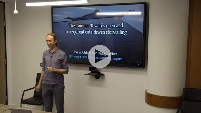
If you prefer text or do not have 45 minutes to watch the talk (right now), I wrote a short summary that highlights the most important ideas from the talk. You can also check out the talk slides, although I'll include the most important ones here.
Why open data-driven storytelling matters
When I first started thinking about this topic back in 2015, I found it quite hard to convince people that working on tooling for transparent way of telling stories with data is something important. Sadly, times have changed and the recent events in the world gave me a completely new way to talk about the project...
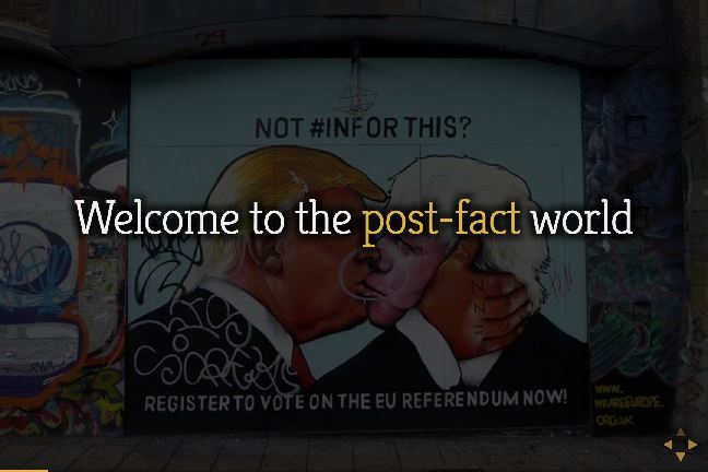
The term post-fact has been chosen as the word of 2016 and there are rumors that statistics is becoming less relevant in public discourse. The term post-fact does not mean that more space is given to messages that are not true. It means that it does not matter whether a message is true or not - and this is also fits with the disinterest in statistics (and expert opinions).
Facebook and social networks often get blamed for helping to create echo chambers and social bubbles (which they probably did), but I think that is only a part of the story. Facebook makes it really easy to share your opinions and engage with others.
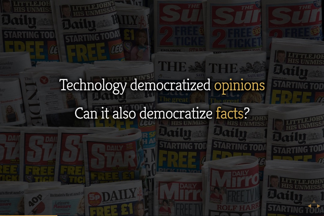
I believe that a part of the reason why facts are becoming less relevant is that working with facts is very hard and a bit dull. If you want to share an opinion on Facebook, you get a plenty of tools to make it more fun. What if you want to share a story or an observation supported by data from a trustworthy data source? It will be really hard and, in the end, you'll just end up posting a chart as an image that nobody can verify and further interact with.
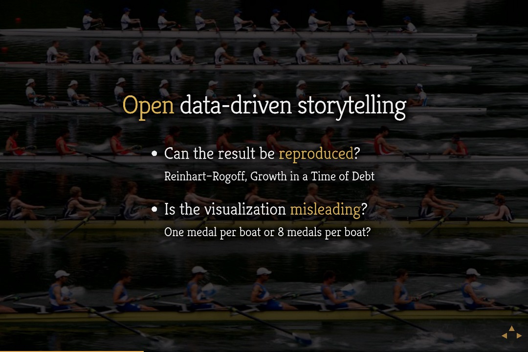
Of course, the idea that everyone will get excited about facts backed by data is idealistic, but you can use data to tell interesting stories that you would not be able to tell without data. If they are interesting enough, then people will want to read them. A nice recent example is the Visual history of which countries dominated the summer Olympics by New York Times.
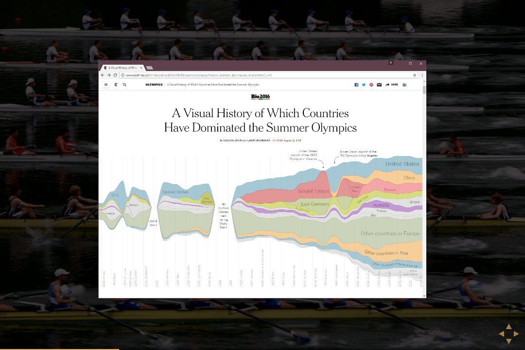
The Olympic history visualization would not be possible without data, but it tells an interesting story. Just by looking at the visualization, you can see the two world wars as well as the cold war (American boycott of games in Soviet Union followed by Eastern Bloc boycott of the games in USA).
The visualization also makes you think about a number of other interesting questions. For example, what would the chart look like for selected countries that you're particularly interested in? Sadly, reproducing a data visualization project like this is very hard, even if the original publisher releases a lot of the code and data. However, being able to see how the visualization has been created and reproduce it is important for a number of reasons.
Letting people modify the visualization to answer their own questions, and perhaps even share their results, is one reason why the open nature is important. Now, I do not expect everyone to do this, but I think the few who will can help recover some of the trust in facts.
However, open data visualizations also need to be reproducible and invite the reader to check that data is not used in misleading ways. A good example of the need for reproducibility is the Growth in a Time of Debt paper, which inspired many economic policies during the 2008 crisis and turned out to be hard to reproduce and likely contained mistakes.
Being able to understand how exactly has data been transformed is equally interesting. For example, in the Olympic games visualization, you can treat team sports as a single medal or as individual medals. This skews the results quite a bit, because you award 8 medals for rowing and even more for football instead of one. The reader should be able to understand this and change it if they want to see the other view!
Towards open data-driven storytelling with The Gamma
Addressing the issues above is what I'm trying to do with The Gamma project. You can find more information about the project in an article I wrote earlier and on the project homepage. The Gamma tries to make producing transparent and open data visualizations easier by giving you a simple web-based scripting language where you can integrate external data (using type providers), aggregate it and easily link it to a chart.
The key idea here is that there should be a script behind every visualization or every other use of data in an article. A chart embedded as an image is just an image - you may trust that it has been produced correctly or you may not, but unless you recreate the entire analysis on your own, you cannot do anything else. Treating article as a program gives you a completely different perspective.
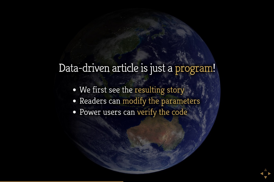
When you visit an open data-driven article as a reader, you will first see the original version of the article as produced by the author. However, the work on programming languages and tools gives us an enormous number of tools that we can use on data-driven articles once we start seeing them (or their backing representation) as programs.
-
You can use provenance tracking methods to understand where data is coming from. For example, is the conclusion based on generally trustworthy data sources such as the ones available through the Open Government Data?
-
You can use other program analysis methods to look for potential errors or misleading calculations. Is the visualization extrapolating from too few data points? Is it adding numbers with wrong units?
-
You can provide additional context. A number telling you that GDP per capita in the UK is $41,787 does not tell you much. If we know where the number comes from, the article can automatically generate comparison with previous years and similar countries.
-
You can automatically generate user interface that lets the reader change some of the parameters of the visualization without even looking at the code. For example, see some of the examples from my Olympic data visualization.
In summary, thinking about article as a program is a powerful paradigm that can generate a number of ideas for tools that help make data visualization easier to understand, less misleading and more fun.
Implementing all of these is a lot of work, so I started with a couple of them. To make the early version of The Gamma as easy to use as possible, it is available as a standard JavaScript component (thegamma-script on npm), which you can easily embed into your web pages. The project is licensed under the MIT license and is hosted on GitHub. See my previous blog post for more information about the package.
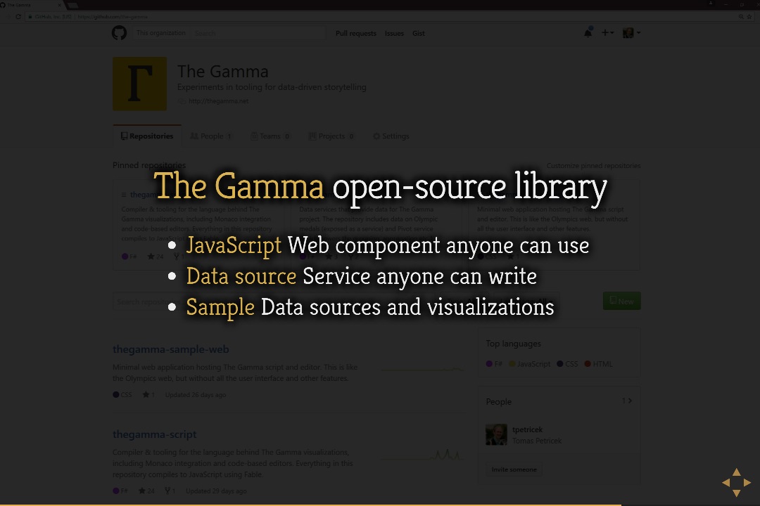
If you are interested in using the JavaScript component, check out the documentation for developers. The most interesting aspect is that you can easily provide your own data sources for the component, simply by implementing a REST service that handles querying of the data. This is documented in the providing data section of the documentation.
In summary, I do not think that programming tools alone can recover faith in statistics and help tackle the problem of post-truth politics or fake news. There is a lot more that needs to be done. However, if you are a developer building data visualizations, then I think your work can contribute - open and transparent data visualizations matter not just because they can be checked and reproduce, but more importantly because they encourage a new way of thinking. Rather than creating opaque reports that only experts can produce, we need to turn data science into something that everyone can engage with!
Published: Thursday, 2 March 2017, 12:53 PM
Author: Tomas Petricek
Typos: Send me a pull request!
Tags: thegamma, data journalism, programming languages